Workspace
Mobile App | Design Sprint
Introduction

Freelancers and remote employees often depend on public places, like libraries and coffee shops, to do their work. But in many cases, they find themselves spending more time searching for the right place with the right amenities than actually getting work done. There are so many factors that contribute to making a space ideal for remote work, yet this information is neither easily accessible nor found in one convenient spot. During a 5-day design sprint hosted by Bitesize UX, I worked to design a location-based mobile app to help remote workers find new places to work and share tips and advice with one another.
My role: UX Designer (solo)
My RESPONSIBILITIES:
reviewing user research
rapid ideation, using a modified version of the Google Ventures design sprint
prototyping and testing design solutions
Day 1 - Map
User Research
I began by identifying the problem through user research. I reviewed survey results collected from 9 freelancers about their experiences finding public spaces from which to work. In addition, I listened to an in-depth interview with a freelance copywriter as she explained her frustrations and specific pain points. The research helped me narrow in on the problem and create a persona of the primary user.
“I usually need to jump on the computer for a video chat - so, I need to make sure the WiFi is good, and that there isn’t too much background noise.”
GOALS:
Understand user expectations, behaviors, needs, and motivations
Fill in any gaps in my knowledge about our users or the challenges they face
Draw key insights that help align the design with the needs and goals of users
Key insights:
Freelancers and remote workers often work in a variety of different places (as opposed to having one go-to spot).
The amenities that are available at a given public space dictate whether a freelancer will decide to work from there or not.
Freelancers and remote workers prefer less crowded workspaces that aren’t noisy and have amenities such as WiFi and public restrooms.
Additional pain points include being unfamiliar with places nearby, not being able to see the space before going there, not being able to find a seat during peak times, and having to spend too much time sifting through reviews to find relevant information.
End-to-End User Experience Map:
In true design sprint form, after gathering key insights from user research, I began imagining possible solutions. Starting with my user on one end and the ideal end-goal on the other, I created an end-to-end experience map by filling in the steps that the user would need to take to achieve that goal.

Day 2 - Sketching
On Day 2, I used brainstorming and sketching activities to help move from an abstract idea to something concrete. These activities helped me gather inspiration from already popular and successful apps as well as brainstorm different design solutions and see my ideas side-by-side.
Modified Lightning Demo
I began by completing a modified lightning demo in which I looked at products, interfaces, and screens that present inspiring solutions. I chose to examine 4 different apps. I looked at Workfrom and Breather, both of which are apps that help remote workers find spaces from which to work. I also looked at Yelp and Google Maps, since both of these widely-used apps have large, organized business directories but also great location and filtering functionalities.
Workfrom
Workfrom is an app and website that helps remote workers find public places and coworking space to work from.
Inspirations:
WiFi Password information shared in the app
Map with pins of spots nearby
Simple icons for easily accessible information about amenities
Community aspect (others who have worked in the space) → users “Clock in” once they arrive
Breather
Breather is a service that helps remote workers find access to professional meeting rooms and spaces in order to host meetings or group events.
Inspirations:
‘Good for’ section (that also says what the space is NOT good for)
Extensive and expandable list of amenities
Clean, minimalist aesthetic
Yelp
Yelp is a directory service that helps people discover local businesses ranging from bars, restaurants, and cafes to hairdressers, spas, and gas stations.
Inspirations:
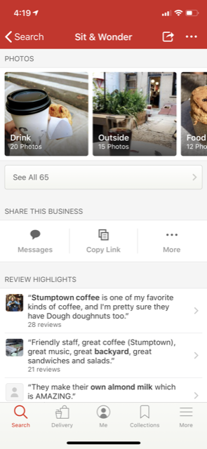
Crowd-sourced photos categorized by type (“food”, “outside”, etc.)
“Ask the community” section where users can ask one another questions
Extensive filtering options
Review highlights that are organized by commonly used words or phrases (i.e. “backyard” or “own almond milk”)
Google Maps
Google Maps helps users navigate the world around them by providing directions and helping them discover nearby businesses.
Inspirations:
‘Popular times’ graph about crowdedness by date and time
Focus on navigation information (directions button and information about nearby subway stations)
Pills for filtering reviews easily (commonly mentioned words/phrases)
Ideation
Crazy 8s:
With an understanding of the target user and the long-term goal, as well as inspiration from existing navigation and restaurant directory apps, I began brainstorming solutions. I used the Crazy 8s exercise to quickly sketch possible solutions for the app’s most critical screen. In deciding which screen to begin sketching, I considered questions such as:
At which step will the user complete the primary activity?
Which screen is most important for solving this problem?
Which screen is the most complex?
For my most critical screen, I chose the location recommendations screen. After a user filters for the amenities that are most important to him or her, this is where he or she will browse location recommendations and make a selection.
Solution Sketch:
For my solution sketch, I created three panels that show the critical screen as well as the screen that comes directly before it and the screen that comes directly after it. I choose this half-map-half-card layout for the location recommendations screen because of its simplicity in displaying information, effective use of space, and the ability to sift through results quickly.
This sequence starts with the user filtering for the most important amenities needed on that day or in that moment. Next, the user can browse a map of recommended locations that’s already been narrowed down for them. Then, the user can click on a location card to see the location profile and read more detailed information, view photos, read reviews, or get directions.
Day 3 - Decide
Storyboard
Expanding on my 3-panel solution, and with UI elements and information architecture in mind, I created a multi-panel storyboard
This storyboard shows the main task (or red route) that someone would use the app to accomplish: finding a great public place to work from.
While I didn’t sketch out every possible interaction that may take place in the app, I sketched all the screens and interactions that would take place from the moment the user logs in to the user actually arriving at the location and starting to work.
Day 4 - Prototype
On Day 4, I built a prototype of my app in Sketch. Using a UI toolkit, I built out a simple version of the app with only the screens from my storyboard and the most basic functionality needed to test my design. I created a clickable prototype in InVision to help me evaluate my design choices and gather useful user feedback for future iterations.
After logging in, the user lands on a skippable filters screen that asks them to select the amenities and conditions they need to get their work done that day. As was discovered in user research, these considerations are most important to remote workers searching for a public space to work. The user can select as many filters as he or she wants to use in the search criteria or skip this screen and search solely based on location.
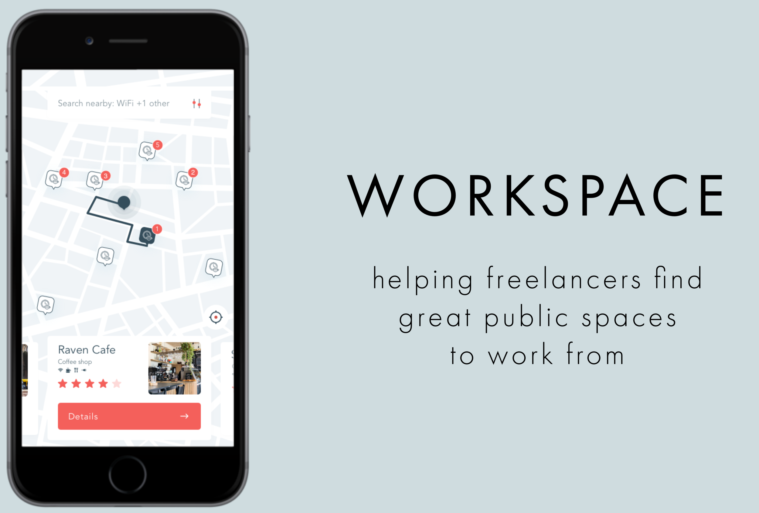
Once the user selects or skips the filters, he or she is taken to the location recommendation screen, a location-based map that shows recommendations for nearby public workspaces. The recommendations are ranked according to the chosen filters, and the top recommendation is highlighted on the map (with directions) as well as shown on a clickable card at the bottom of the map. Other recommendations that meet the criteria chosen in the filters are listed on cards that can be browsed by swiping horizontally. The map and directions from the user’s current location update when the user scrolls to a different workspace. Clicking on the ‘Details’ button on the card opens a profile for the location. The user can use the search bar at the top of the screen to edit the location (i.e. type in the name of a city as opposed to searching nearby) as well as adjust the filters.
The location profile screen includes all the information a user would need to make a decision about whether a workspace is a good fit. Within the location profile, there are swipeable pages that include a location overview page, a workspace page listing all the available amenities, a photos page, and a reviews page. The user can swipe through to read the detailed information or simply click ‘Take me there’ to get directions to navigate to the workspace.
The overview page includes a brief description of the space, contact information, and a ‘Popular Times’ graph that reflects how busy the location might be at a given hour and how many tables might be available.
The workspace page includes a detailed list of all the available amenities and details about the space.
The photos page defaults to showing all photos (posted by the business as well as users) but can be filtered by category to help a user more quickly decide if the space looks right for him or her.
The reviews page displays the most useful reviews as well as highlights the important keywords in those reviews. The user can use the pill buttons at the top to filter the reviews by commonly-used terms, eliminating the need to dig through reviews to find relevant information.
Once the user has decided on a workspace, he or she can click ‘Take me there’ to receive directions. If the location is within a 15-minute walk, the app will default to showing walking directions, however, the user can use the dropdown menu on the directions screen to change to biking or driving directions. If the location is farther away, the app will default to showing driving directions.
Like other navigation apps, once the user clicks ‘Start Navigation’, the map shifts to a navigation screen in perspective view, making the step-by-step directions clear and easy to follow. There’s an estimated arrival time, based on the distance from the workspace and the chosen mode of travel, displayed at the bottom of the screen. Once the user reaches the destination, he or she receives a message confirming the arrival.
Day 5 - Validate
User Feedback
On the final day of the design sprint, I focused on getting feedback from users. I used Jake Knapp’s five-act interview technique with 5 users, all of whom occasionally work remotely in public spaces in their respective cities.
key insights:
Users were unsure of how the options were ranked on the location recommendations screen.
Users liked the easy navigation of and abundance of information on the location profile screen, specifically the information on the ‘Workspace’ page and the ability to sort through reviews by commonly used words/phrases.
Users didn’t think they’d use the built in navigation.
Opportunities for future iterations:
Make it clear how the places on the location recommendations screen are ranked (i.e. add a label for “Top Recommendation”; include a way (maybe with a symbol or through color) to indicate that a location has 3 of the 4 filters selected).
Add in functionality so that a user can rank or emphasize a certain amenity so that it’s weighted more in the filtering of results (i.e. emphasize that more than anything, he or she cares about good coffee or a quiet place to work).
Build in a List View (as opposed to just the Map View) so that users can see the options nicely compared to each other.
Learnings
Here are some of the key takeaways I learned from this modified GV design sprint:
It is okay (and encouraged) to draw inspiration from already successful products. There’s a reason they are popular and widely-used!
A GV design sprint is the perfect setting in which to take risks! The quick turn-around of this process lends itself to doing so.
The GV design sprint is an efficient, low-risk method of bringing a new product to market. Having the opportunity to do a modified, solo version makes me excited to participate in a full-scale, team-based design sprint.


