Sonder
Mobile App | Capstone Project
Introduction
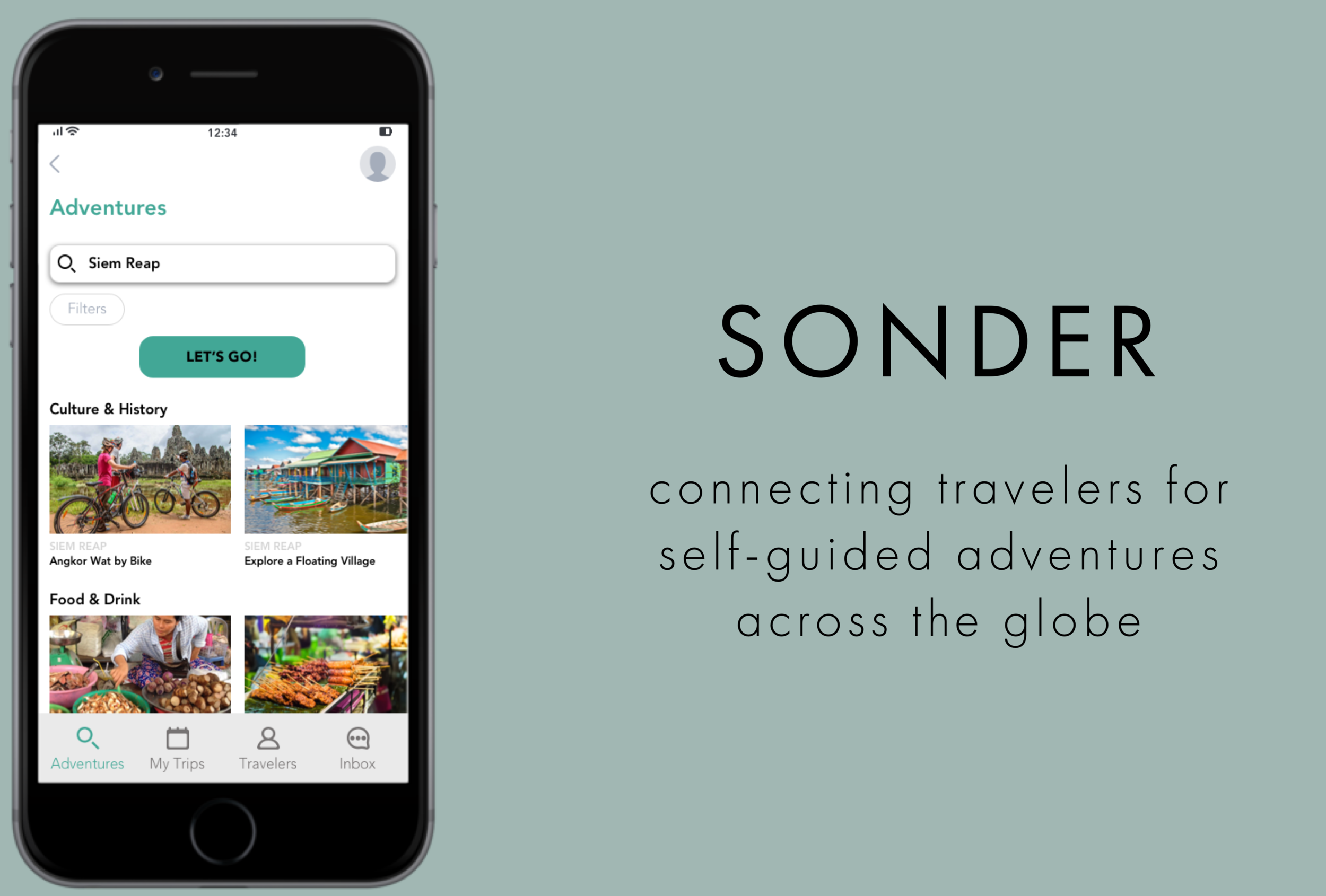
Solo travel is on the rise. Yet, despite the surge in people choosing to travel alone, many solo travelers still seek meaningful social connections as part of their travel experiences. But why leave meeting the right travel companions up to chance? What if you could eliminate having to be in the right place at the right time and find others with whom to share high quality travel experiences? Sonder is an app that connects like-minded travelers for self-guided adventures in destinations across the globe. As a capstone project for my UX design course at Springboard, I decided to research and explore the pain points of solo travelers and design a native app as a solution to improve the social aspect of the solo travel experience.
My role: UX Designer (solo)
My RESPONSIBILITIES:
leading an end-to-end human-centered design approach
conducting secondary and user research
sketching, wireframing, and prototyping design solutions
usability testing
iterating on the designs
Process

Research
Secondary Research
To further understand the scope of the problem, I conducted secondary research, which led me to some interesting statistics about the recent surge in solo travel.
In 2018, one in four American travelers said they would travel on their own that year. 1
The average monthly search volume for the term ‘solo female travel’ on Google grew by 52% between 2016 and 2017. 13
In top cities like Buenos Aires, Toronto and Oslo, 14% to 27% of all Airbnb bookings are made by solo travelers. 11
My research also gave me some insights into the motivations behind solo travel and the significance of social interactions while traveling alone:
Solo travelers want to see more of the world and they're not willing to wait for others. They like the freedom to do what they want, when they want. 12
One of the main motivations for traveling alone is to embrace meeting new people whilst traveling. 2
Social space is one the most important considerations for travelers when choosing a hostel. 10
Competitive Analysis
In exploring how to enhance the social experiences of solo travelers, I chose to evaluate three different companies that aim to bring people together, particularly when traveling: Travello, Couchsurfing, and Meetup. I evaluated each app based on Nielsen Norman Group’s Heuristics in order to determine what makes these products successful and how to incorporate those aspects into my own product.
main takeaways:
Create clear propositions or calls to action for users
Maintain a clean aesthetic and minimalist design
Use language in the app that’s consistent with real-world conversations
Emulate the friendly aesthetic of Travello, the thoughtful organization of Meetup, and the simplicity of Couchsurfing
Exploratory Survey
After screening participants, I sent out an exploratory survey to anyone who had traveled solo to a foreign country at least twice. The survey received 25 responses.
goals:
Dig deeper into the pain points related to meeting others while traveling
Understand how proactive travelers were willing to be to meet others
Key insights:
Solo travelers are interested in meeting others but also value time on their own.
When it comes to meeting others, solo travelers are most concerned about:
1) also having enough time on their own
2) meeting people who want to do the same activities as them
3) knowing where to go to meet other travelers
4) feeling comfortable approaching others
A majority of solo travelers describe themselves as “active” or “very active” when it comes to meeting others, meaning they opt into social situations and organized activities and try to approach others or start conversations when possible.
Interviews
After reviewing the survey results, I was able to interview five people more in-depth about their solo travel experiences. The participants were a mix of long-term solo travelers and those who had taken shorter solo trips. They were from different countries (U.S., Spain, & New Zealand) and had traveled alone in different parts of the world (U.S., Europe, Asia, Australia, South America).
“Sometimes you don’t do the things you want to do because you’re with certain people - that’s something you learn as you travel—to be more selective about who you travel with or how you spend your time.”
“I put a lot of my energy into meeting people while traveling, and I don’t think that the current technology out there is very helpful for meeting those needs.”
Analysis
Affinity Mapping
After analyzing my interview notes, I created an affinity map to identify my participants’ common pain points.
Key insights:
Solo travelers love the freedom of traveling alone.
Solo travelers want to meet others but value having certain experiences on their own.
Social goals change depending on the length of the trip.
Finding “the right people” is important.
Solo travelers seek good company, safety, and the exchange of travel tips.
“We’re meeting up now and that’s amazing, but you have your own things you want to do, I have my own things I want to do, so let’s meet up where we can and see where we overlap.. But everyone should have their own adventure.”
Empathy Maps
I then created empathy maps to help organize the insights, observations, and quotes I collected from my user interviews. These empathy maps helped me better understand my users’ pain points, goals, feelings, thoughts, and behaviors. I found that I was able to group what I heard in my interviews into two different types of users:
The Solo Backpacker
The Independent Adventurer
The Solo Backpacker
The Independent Adventurer
Personas
I came up with two personas based on my insights from my interviews and the subsequent empathy maps that I created. These personas helped ensure that my design decisions were relevant to the type of users who would be most likely to use the app.
Problem Statements
Next, I drafted problem statements with an understanding of my target users and their needs:
How Might We…
provide solo travelers a way of creating enriching social connections while also balancing alone time?
allow solo travelers to plan their travels while also helping them maintain the flexibility they desire?
create a reliable forum for information sharing that allows solo travelers to find and share the best things to do?
Ideation
Solution Ideas
My brainstorming process involved sketching ideas that were potential solutions for my How Might We questions. I used a strategy called Crazy 8s to rapidly ideate and sketch my ideas.
User Stories
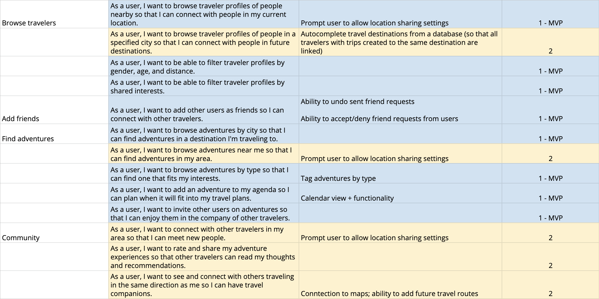
Then, with my knowledge of my users’ needs, I created a list of user stories or tasks I wanted my users to be able to complete in my app. I categorized this list by priority. The most important features—those that helped my users reach their most essential goals—were incorporated into my MVP, or minimum viable product. Less important features were included in lists for future iterations of the app.
Design
Sitemap
With an idea and some key user tasks in place, my design phase began with creating a sitemap for my app. Thinking through how users would move throughout the app helped keep them at the center of my design and ultimately informed the information architecture of the app.
User Flows
The next step was thinking through the critical user flows—the specific paths or flows a user would follow within the product. These included adding a trip, adding an adventure, and inviting another traveler on an adventure.
Sketching
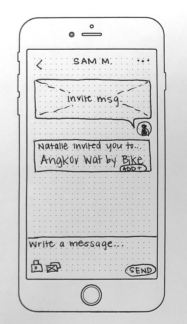
I then began sketching these user flows. The main goal of these sketches was to get my ideas down on paper so that I could test and adjust them quickly before creating high-fidelity designs. I sketched the app’s red routes, or critical design paths.
Red routes:
adding a trip
adding an adventure to a trip
inviting someone to join an adventure
day-of adventure
additional screens: splash screen, login screen, profile screen
Guerilla Usability Testing
Next, I conducted guerilla usability testing. I loaded my designs into POP by Marvel and had participants complete several tasks, talk me through their thinking, and answer a number of questions. You can see my prototype here.
goals:
Gather initial feedback on the designs (Do they like the design? Is it intuitive?)
Understand how travelers might envision using this type of app while traveling
Key insights:
Users weren’t able to “get out” or “go back” because of dead ends in the design
Users wanted tailored results; most were more inclined to search by city to narrow down the adventure choices and wanted options to plug in dates/seasons and to filter activities by type
Users appreciated customization
Design recommendations:
Fix navigation issues by adding “Back” buttons and opportunities for users to “X-out” of pages; ensure a more consistent nav bar throughout the app
Make it so users can search adventures in many different ways (by country, by city) as well as filter by adventure type, season, dates, etc.
Make information about which adventures are geared towards solo travelers vs. groups more obvious
Prototype
Low-fidelity Wireframes
Next, I created low-fidelity wireframes using a UI toolkit in Sketch. These wireframes helped me determine how different elements would be placed on each screen. From there, I created wireflows as a way to think through how users would interact with the various components of the product. And finally, I put these wireframes into InVision so that I could create the first clickable prototype for my app.
UI Design
Then, I created a mood board and style guide for my app to capture a certain aesthetic and ensure that my designs were accessible and engaging.
Design decisions:
Cool color scheme
Blue/green as main color (associated with trust and reliability as well as harmony, nature, and peace)
Attention-grabbing photography
Avenir font (sans-serif typeface good for mobile design)
Handwriting font for logo and onboarding
Test, Iterate & Evaluate
High-Fidelity Prototype: Version 1
I then iterated on and visually treated my screens based on my UI decisions. I created a V1 high-fidelity prototype in InVision to use for usability testing.
Usability Testing: Round 1
I conducted 4 moderated testing sessions, both in-person as well as via Google Hangouts. All four participants were familiar with using mobile apps and had an interest in travel.
goals for TESTING round 1:
Test the design of the app
Ensure that it is intuitive and easy to use
See whether the purpose/main use cases for my app were clear
See if the relationship between adventures and trips made sense to users
Determine the best opportunities for design improvements
After the first round of usability testing, I uncovered a few critical issues with my app design that needed immediate attention, as well as several smaller issues that I felt would be beneficial to fix. I then came up with a list of recommendations for my design and prioritized them.
Design DECISIONS:
Redesign the empty state for My Trips so it’s obvious why Adventures need to be added to Trips
Add onboarding so the adventure-trip relationship clear to first-time users
Add a splash screen and update the copy on the homepage to highlight the low-cost, self-guided nature of the adventures
Change the placement of the filter icon or make it a button instead
Reorganize the Travelers screen to have two categories: Nearby Travelers and My Friends
Make the “Add Friend” button more prominent on user profiles
Change the Reschedule button to say “Modify/Cancel” so the ‘cancel’ option isn’t hidden
High Fidelity Prototype: Version 2
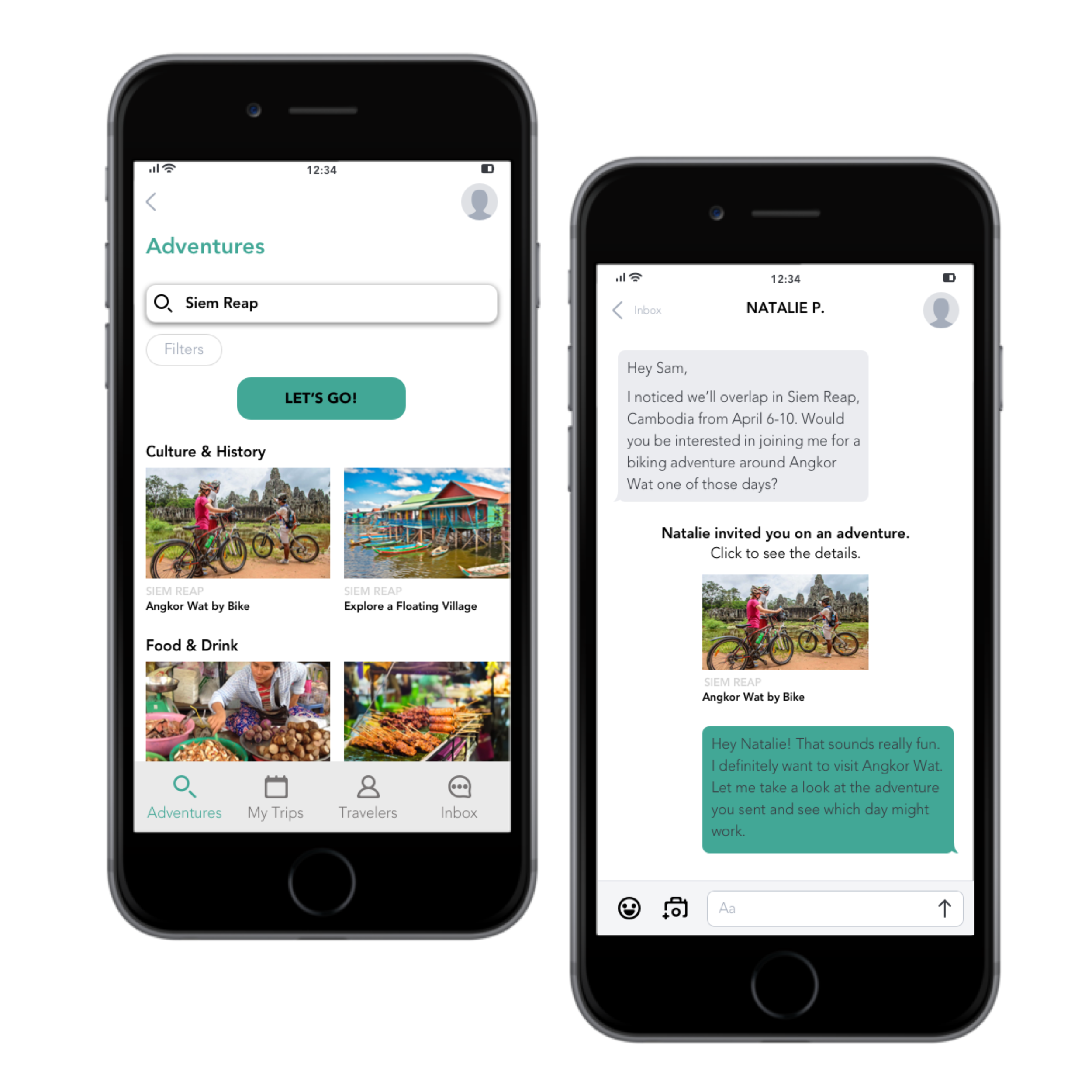
Based on my list of design recommendations, I went back to my screens and implemented my solutions. I put these iterated screens into a V2 high-fidelity prototype for a second round of usability testing.
Usability Testing: Round 2
The design process is never truly finished, and typically, a designer would continue to iterate on the designs until the prototype accurately reflects the participants’ feedback. However, for this project, I used this second round of usability testing to think about possible future iterations of my design.
goals for TESTING round 2:
Evaluate whether the changes I implemented resolved the issues I saw in the first round of testing or if these issues persisted
See if my new designs raised new usability issues
Determine a direction for future iterations of the app’s design
Areas for further improvement:
Make the carousels on the adventures search results page more obvious
Link the functionality between the messaging feature and the schedule feature
Add sorting functionality to the adventures and build out the reviews function of the app
Make the adventure category headings into links so users can see adventures in each category in list form
Create a message board or ‘Classifieds’ section where users find other travelers interested in going on a certain adventure with them
Create a “Favorites” or wishlist section so users can save adventures they’re interested in
Change the wording of the “Schedule” button to either: “Add to My Calendar” or “Add to Itinerary”
Rethink the adventure cancelation flow
Learnings
Here are some of the key takeaways I learned from this end-to-end UX project:
Being responsible for every part of the project, from user research to design to testing is A LOT of work. This is why design teams with specialists exist!
Empathy maps and persons are extremely helpful in understanding user behavior and needs. They lead to more effective, focused conversations and better decision-making.
During the testing phase, it’s important to prioritize which usability issues are most important to fix and to actively avoid adding in new ideas and features.

